Shakila Esthetic
About
This project is an organic esthetic brand. There were two things that were very important for my client.
First, she wanted the logo to have a girlish and cute theme. To achieve this, I chose three colors: purple, which represents lavender since most of her products use lavender; pink, to give a girlish and soft feeling; and yellow, to bring in an element of nature, sunlight, and an organic vibe. Together, this palette creates both an emotional connection and a sense of balance.
Second, she wanted the logo to clearly show that the brand is organic. Instead of placing a leaf separately, I integrated it into the letter K by removing the stem and replacing it with the leaf. This decision improved the readability of the logo and made the organic element feel like a natural part of the design, not just decoration.
This way, the final logo shows her brand’s feminine, natural, and organic identity while keeping the design clean and professional.
Iconic Mark 1

Logo
ٍElement

Combination Mark 1

Iconic Mark 2

Combination Mark 2

#EFBCD6
Color Palette
I chose this pastel color palette because my client wanted the brand to convey a girlish and feminine vibe. Since the target audience is primarily young women, especially Gen Z, I felt these colors would resonate well. That’s why I selected this palette, which I personally love as well.
#BBA1CC
#F2D9A7
#f8f7f7

PACKAGING . BRANDING.
PACKAGING . BRANDING.
-
![]()
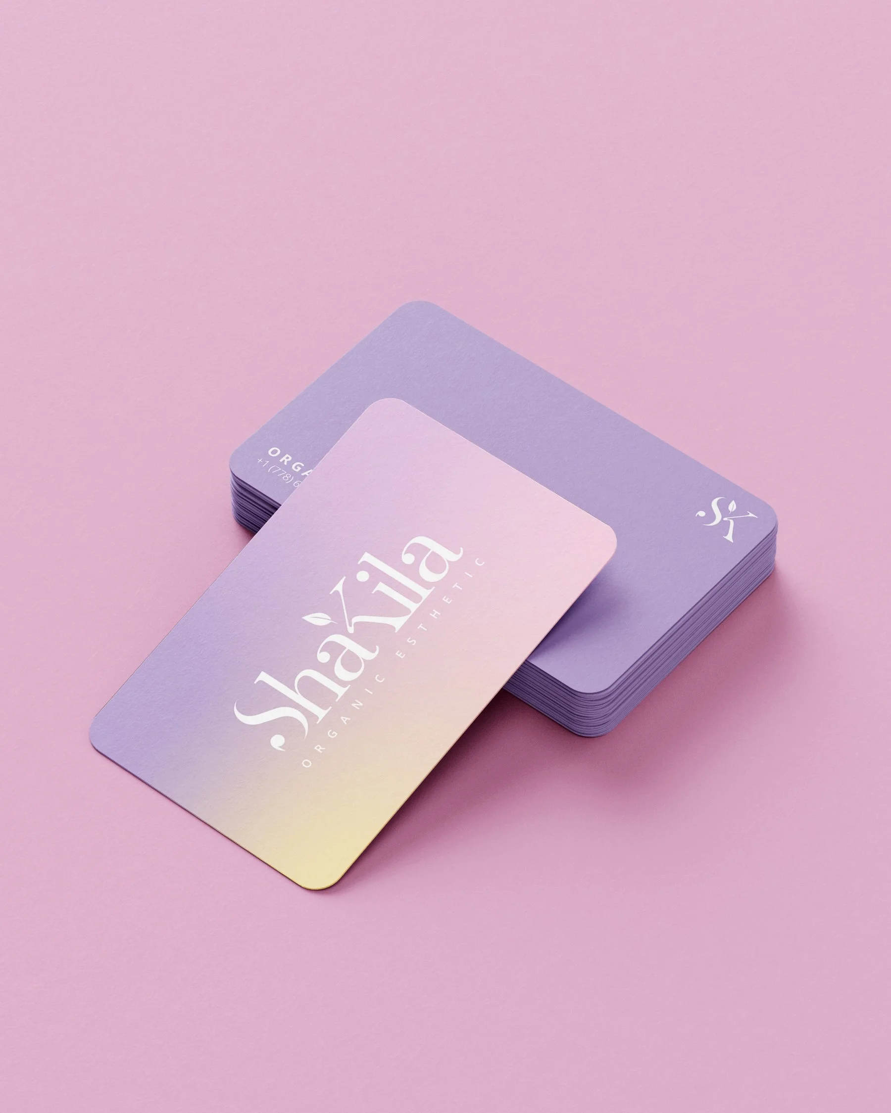
Business Card
-
![]()
Packaging
-
![]()
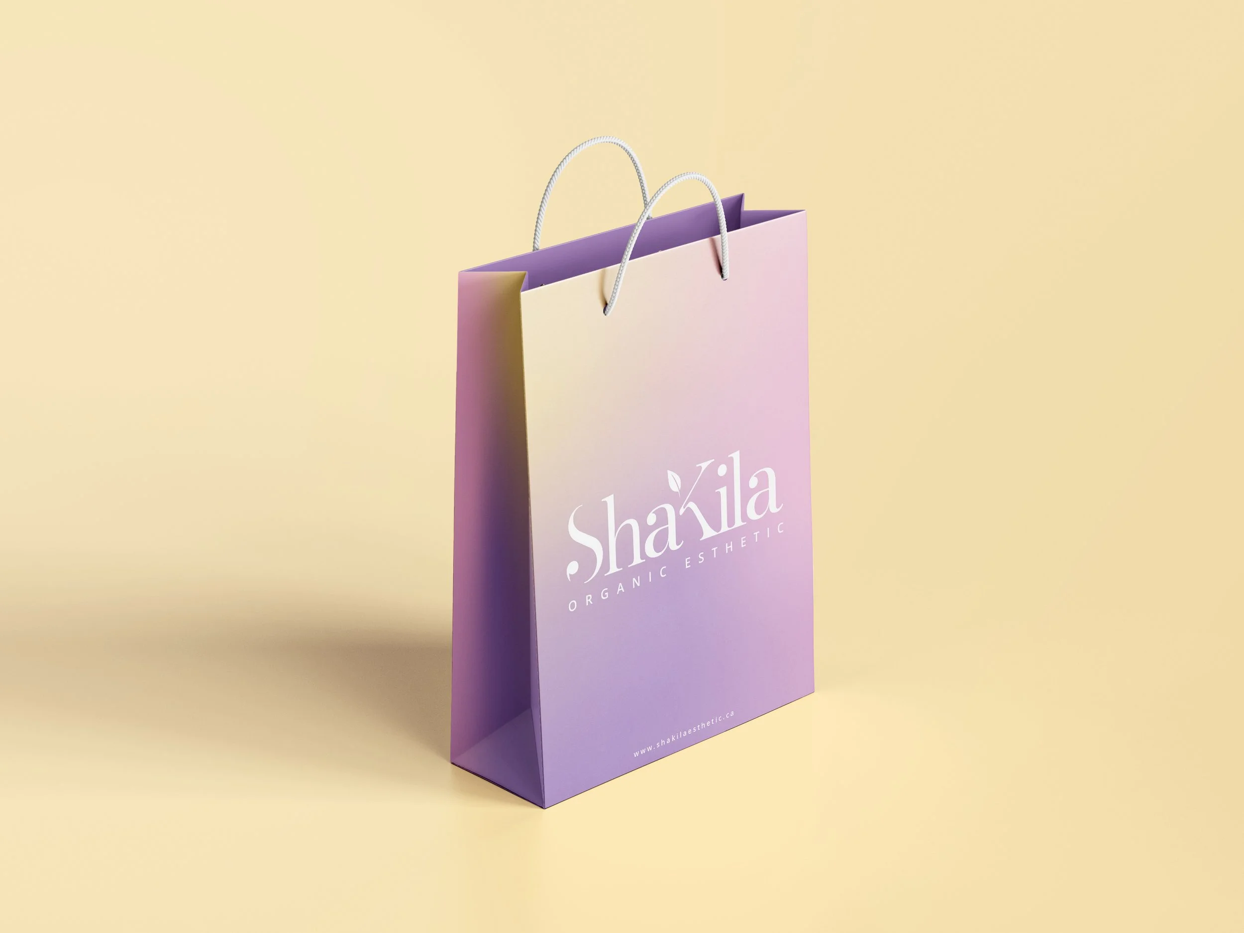
Shopping Bag
-
![]()
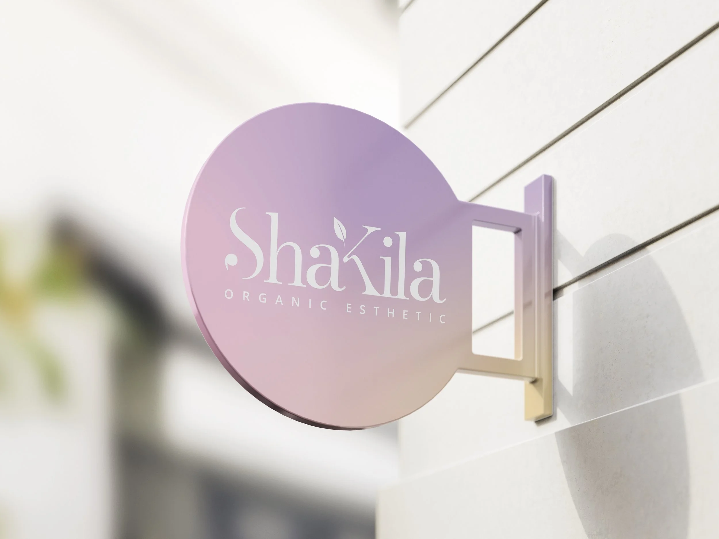
Sign